
LifeSource
Branding, Marketing, Communications, Printing
2024
As a Graphic Design Intern at LifeSource, I gained a variety of skills that are helping me grow as a designer. Not only did I work creatively on projects, I was apart of an exploration of ways to build onto LifeSource's brand. I attended meetings with my communication team, assisted with event set-ups, and became a member of Dia De Los Muertos (Day of the Dead) and LifeSource's Store committee. As for projects that I was apart of, I was able to gain knowledge within marketing collateral, print services, social media influences, and branding.
Much of the designs I was apart of at LifeSource not only embody LifeSource's brand and mission, they also show parts of my own design process and style. I try my hardest to create a connection between one thing and another, and within these processes I was able to collaborate with my creative supervisor on many of these projects with my time at LifeSource.

01
HISPANIC HERITAGE MONTH
Infographic, Illustrations
The Hispanic Heritage Month Infographic was created for the LifeSource Newsletter. It explores creative concepts that represent the importance of Hispanic Heritage Month and how Organ Donation is relevant to this demographic.
For the process of things, I was asked to make an infographic that shows these statistics in a meaningful and engaging way. I included LifeSource's brand colors; as well as other colors that can be associated to this month. I grew on this idea of helping viewers understand who this infographic is representing, when I created the illustrations.


02
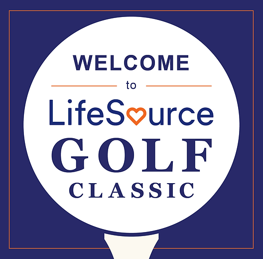
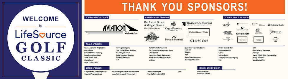
GOLF CLASSIC
Branding, Print Proofs, Event Signage
LifeSource Golf Classic is an event LifeSource does every year. This year was special because it was the year of their new branding and mission.
I was able to be apart of this new transformation, designing the logo that was sent to sponsors and was put on event signage. I was also apart of creating the sponsor banner. This was exciting because it was the first thing everyone at the event saw while walking into the golf course. My creative supervisor and I created a print proof for this, confirming that all dimensions and bleeds were correct.
03
DONOR SABBATH MONTH
Social Media, Marketing Collateral
LifeSource's communication and marketing team, which I was a part of, initiated a mission to include the Church into their supporters.
I was set out to make a few collateral pieces to promote this mission - a social media graphic, and two informational cards that would be placed inside Churches in the Twin Cities. The goal of these were to grow the cause of Organ Donation inside communities that might not know how this process is handled.


04
APPAREL DESIGN
Branding
Every spring and winter, LifeSource has a store where a featured design is put on apparel. This winter, the store committee chose a design that was put together by my creative supervisor and I.
The design that was created was an inspiration to a similar T-shirt design LifeSource's Store put out, where the flowers were organs. In this specific design, the heart is the emphasis, as it is the new logo mark for LifeSource's brand. I had the idea of having flowers grow out of the flower, as it symbolizes growth, connection, and transformation.


Freelance
Branding, Marketing, Communications
2023-2024
My Freelance journey has flourished into a job that I can cater to others that appreciate my design skills and aesthetic.
I have worked with clients to create branding, social media graphics, promotional advertisements and other marketing collateral. I'm pushing myself to network with others that are also in a creative atmosphere. This allows me to show them a different side of creativity - a graphic design perspective. This also pushes me to visualize their creative space and promote it.
Freelancing to me means that I can create a design for a client that still offers insight into my own design ambitions. It's important to me while creating these designs that I am creating a design the client loves, but something that I also love. This keeps me motivated and allows me to gain skills working not only for others, but for myself.
01
FROZEOAT
Branding, Illustrations, Packaging
'FROZEOAT' is a brand and visual idenity made for a group of individuals who were potentially creating a nutritional ice cream sandwich brand.
While I was in the beginning stages of this brand design,
I intended on creating something colorful that was filled with decorations. To visualize this idea, I went ahead and researched by looking at competitor ice cream packages at Whole Foods, Cub Foods, and Target. One competitor that stood out the most to me was Tillamook. This brand is clean and gets straight to the point, but it is missing the aspect of 'yum, summer, fun.' And that's when I came up with the idea of creating this fun brand that includes color variations, decorations, a simple illustration and a yummy feeling to it.


02
Promotional Advertisements, Marketing
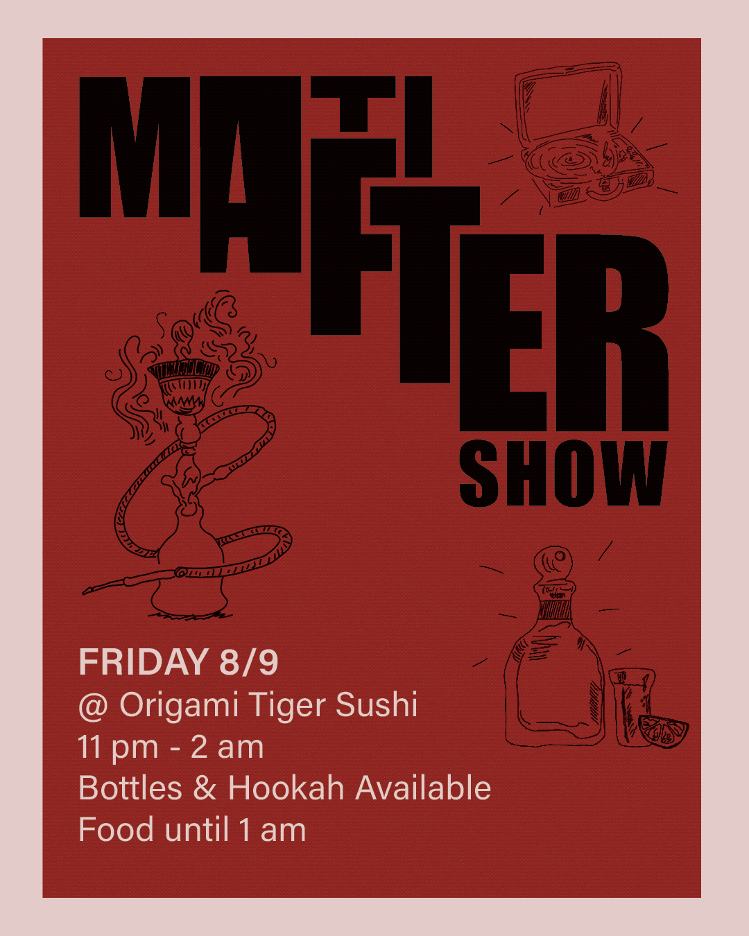
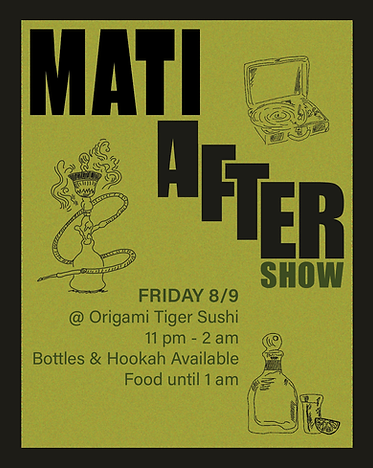
FLYER FOR MATI
I was able to make promotional event flyers for a local Minneapolis Singer/Songwriter, Mati.
The flyer to the right was inspired by TIME Magazine's Title and layouts. It was a tricky project as this picture was already taken, so I had to edit a few aspects of the initial photograph, as well as manipulate the text in order for it to be legible.
The two flyers below were made for an after the show event Mati and his team were hosting at Origami Sushi. My main emphasis was typography, so viewers knew who it was for. I then made it personal, adding simple illustrations that demonstrate the vibe and intentions of this after party.

School Projects
Exhibition, Branding, Book & Game Design, Packaging
2022-2024
School Projects showcase different styles of design I succeeded in during my time studying Graphic Design at the U of M. They all demonstrate different techniques and printing methods that are skills I obtained. These were printed on campus, through the tumultuous trials and errors.
These three projects specifically are some of my favorite designs I have made thus far, they are definitely one of the few I am most proud of because they show my capabilities. And they demonstrate the journey of my Graphic Design career.


FLY 90s Culture
Exhibition, Branding, Illustrations, Printing
01
'FLY 90s Culture' is my final senior project. FLY was made to offer insight into how powerful the 90's generation truly was to the world, as the 90's in a whole was a movement.
At the start of this idea, my first thought for this project was to illuminate nostalgia while also adding
modernistic elements. I was intending to make viewers feel like the 90's were mixed with the present day we live in now. We've been seeing aspects of the 90's come back in fashion and music but it's treated with how the world is now.
The clash of these two ideas, helped me explore solutions for visual engagement and the understanding of this concept, which is where all of the printed collateral comes into light.


02
Anything Goes
Book Design, Typography, Printing
'Anything Goes' Project is a typography booklet made to uncover the methods and mechanics of creating a digital booklet and converting it into a physical booklet.
The main objective of this project was to deliver a booklet that was type heady, with no images. Though, I desired to develop a typography booklet that not only, speaks to my design style, but also a booklet that is engaging to viewers. After pitching the idea to my professor, I added simple images that maintained a specific opacity to ensure that the booklet was still emphasizing typography.


03
RIOT
Game Design, Packaging, Illustrations
'RIOT' is a project that was created for my Packaging & Display course. The objective of this final project was to create three variations of items that are different sizes. In addition it is a fictional brand of your making.
I ended up ideating a project that would challenge me, so I chose to create a game design series that would entail the artistry of Graffiti and the different styles of Graffiti there are. It challenged me in many ways, as I typically didn't design raw and grunge-ish designs before hand. I am happy to say that many of my designs are now more playful because of this project. It was also challenging in the area of production - needing to discover and take in dimensions of all three games, in order to deliver a realistic game series.


